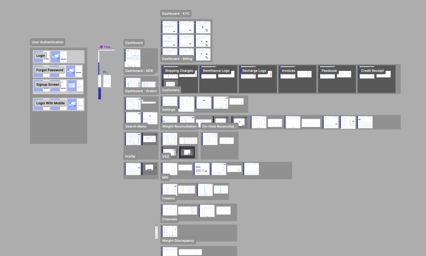
My Process
| Product Audit |
| Defining Problems |
| Competitors Analysis |
| Visual Deisgn |
| Development & Testing |
To ensure the solution truly addressed user needs, I began with a product audit that revealed friction points in navigation, discoverability, and overall usability. From this foundation, I was able to define the core problems, focusing on trust in recommendations, fragmented workflows, and lack of consistency in the experience.
I then conducted a competitive analysis of leading platforms to understand how others approached similar challenges. This process highlighted best practices in onboarding, personalization, and transparency while also exposing gaps we could turn into opportunities.
With these insights, I moved into visual design, crafting a cohesive interface that emphasized clarity, accessibility, and a modern aesthetic. Throughout the development phase, I collaborated closely with engineers to ensure smooth handoff, technical feasibility, and design fidelity.
Finally, I carried out testing sessions with target users, validating design decisions and refining based on feedback. This iterative cycle allowed me to deliver a solution that was not only visually engaging but also intuitive, trustworthy, and responsive to real-world user behaviors.
Key challenges:
- Simplify Complex Flows for Non-Tech Users
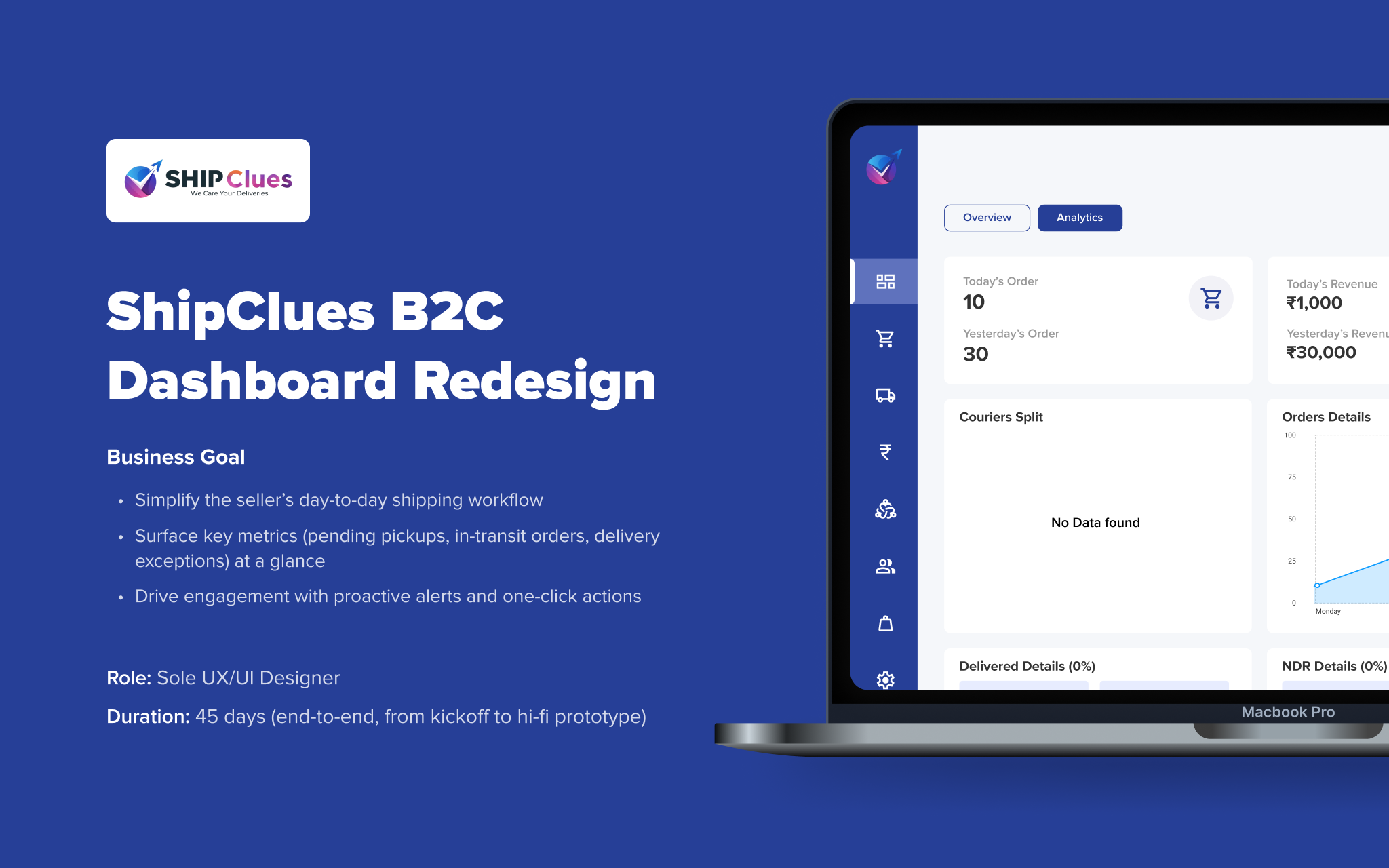
- Optimize the Dashboard & Homepage
- Streamline First-Time Payment & Booking
SOLUTION
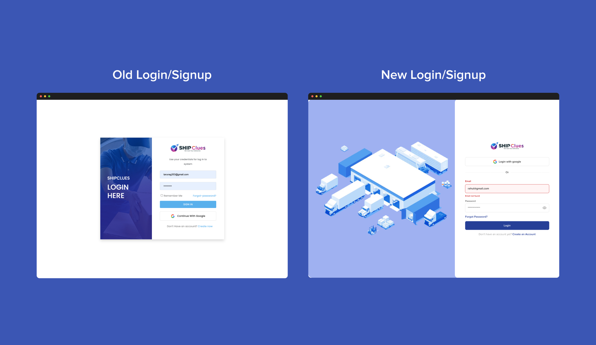
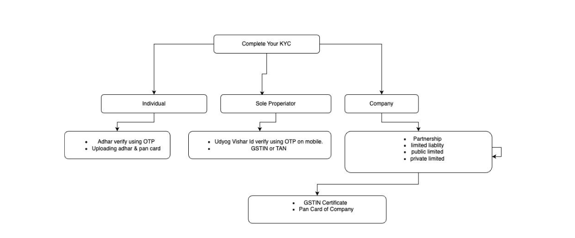
| Rebuilt onboarding flows with simple language, visual explanations of shipping steps, and easy-to-understand tariff cards. The result: users from Tier-3/4 cities felt empowered to book confidently. |
| Redesigned homepage with clean layout: high-impact banners (e.g. “Instant Ship”, “Refer & Save”), trust indicators, and action buttons above the fold. Improved click rate by ~20%. |
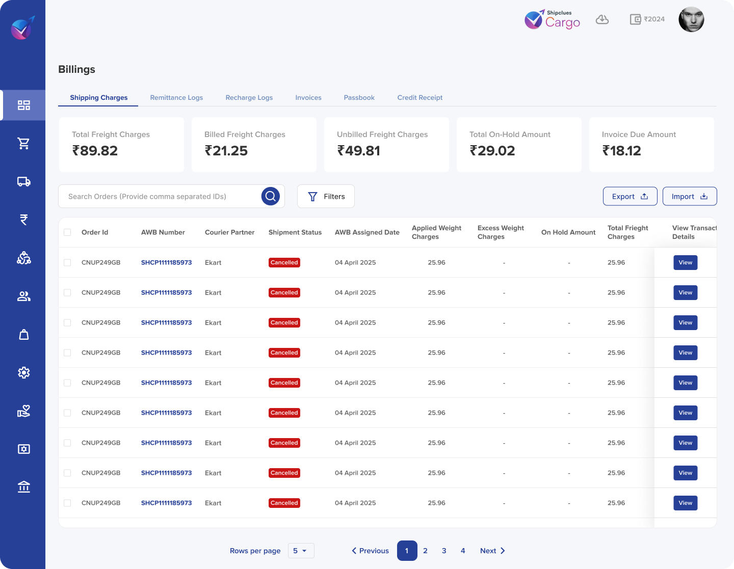
| we focused on visual redesign and trust-building UI changes. This included: Adding security badges and payment partner logos Displaying trust indicators like “100% Refund Guarantee” and “Verified Shipping Partners” Enhancing the visual clarity of the payment screen with a clean, minimal layout and step-by-step progress indicators |
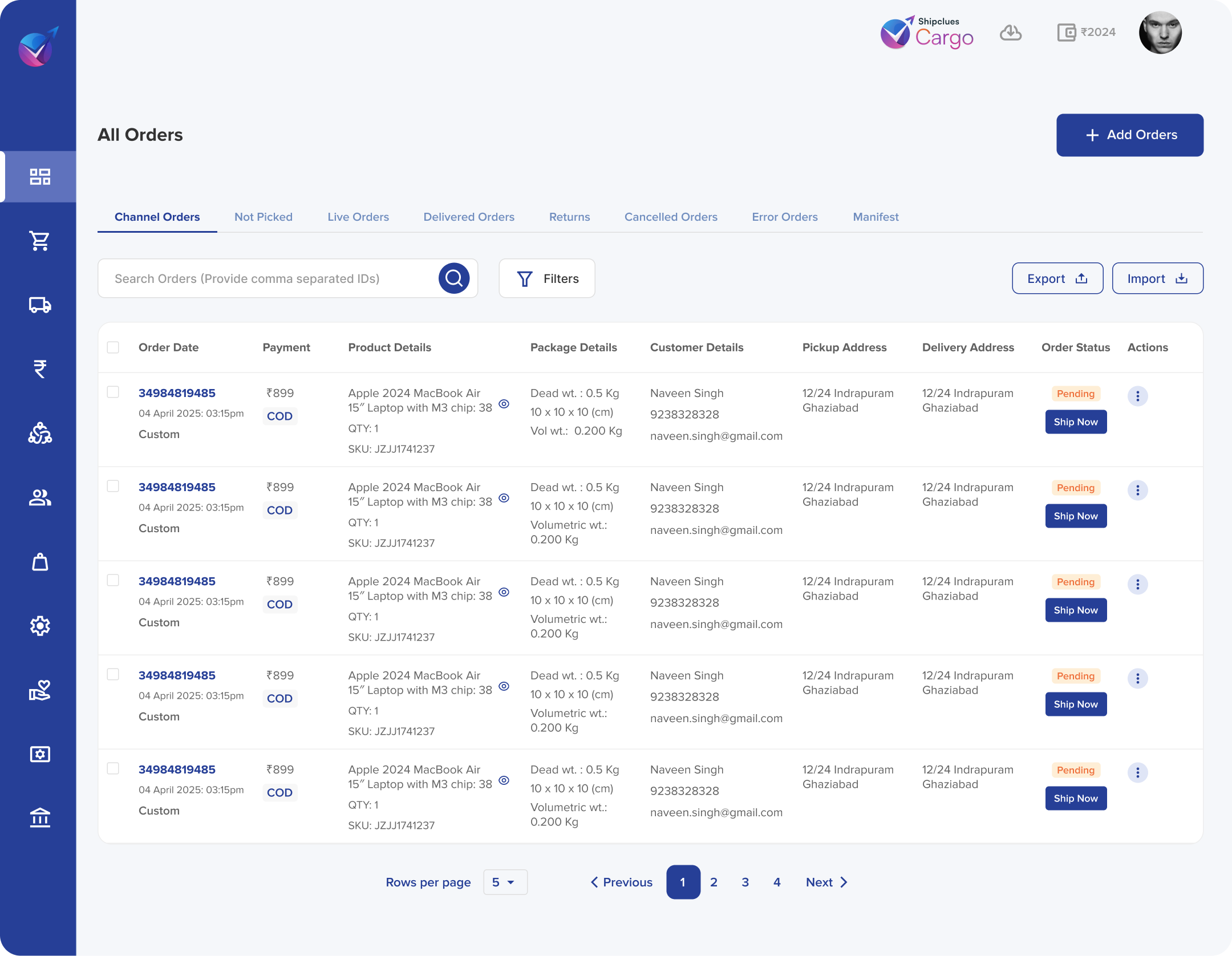
Key Improvements
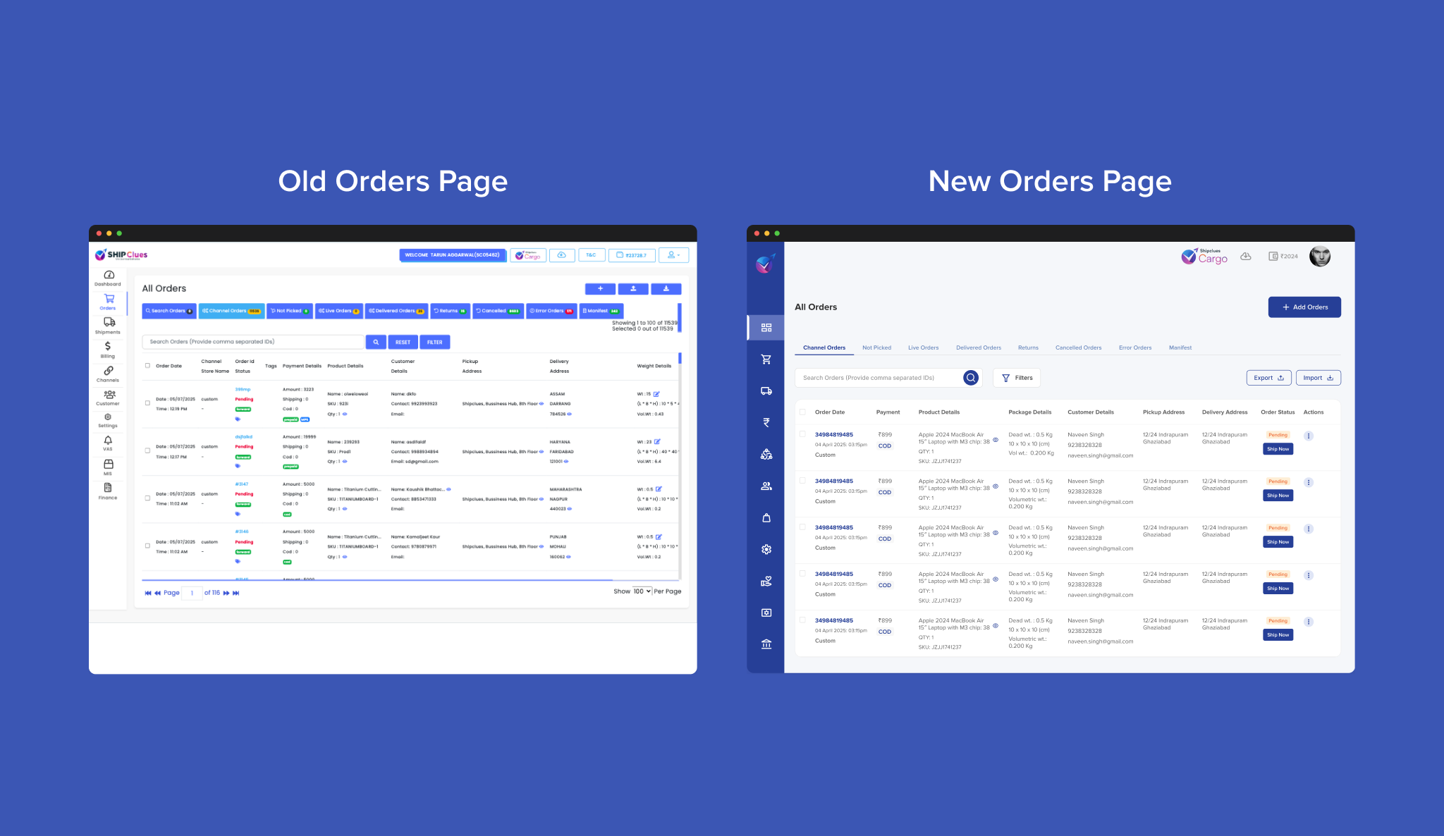
| ✅ Summary cards at top for instant glance |
| ✅ “Retry” & “Contact” right in table rows |
| ✅ Increased spacing & clear labels |
Research & Insights
Competitive Analysis
- Benchmarked top 5 logistics platforms: most dashboards were cluttered, buried critical info under menus.
- Standout patterns: summary cards, inline alerts, contextual quick-actions.
Wireframes & Information Architecture
- Card layout emerged as the quickest way to surface discrete metrics.
- Overview Cards for “Pending Pickups,” “In Transit,” “Exceptions”
- Order Table with inline status badges and action icons
- Alert Panel for real-time notifications
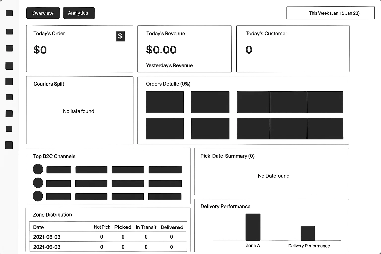
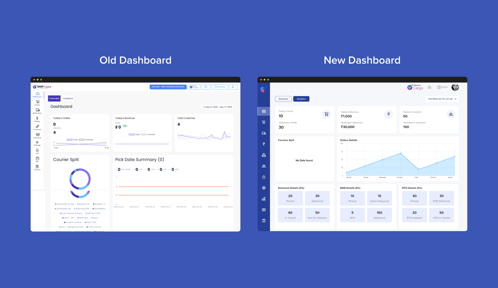
Improved Visual Hierarchy
Clearly separated KPI cards at the top improve scanability.
Cleaner & Modern UI
Cleaner layout, better spacing, and modern typography enhance visual appeal.
Consistent Design Language
Uniform card components across sections create a cohesive look.
Clearer Navigation
Simplified icons with intuitive arrangement improve usability.
Better Data Visualization
Uses shaded line charts for better clarity in order trends.
Enhanced Component Labelling
Delivery, NDR, and RTO statuses are grouped clearly for quick insight.